Grids.
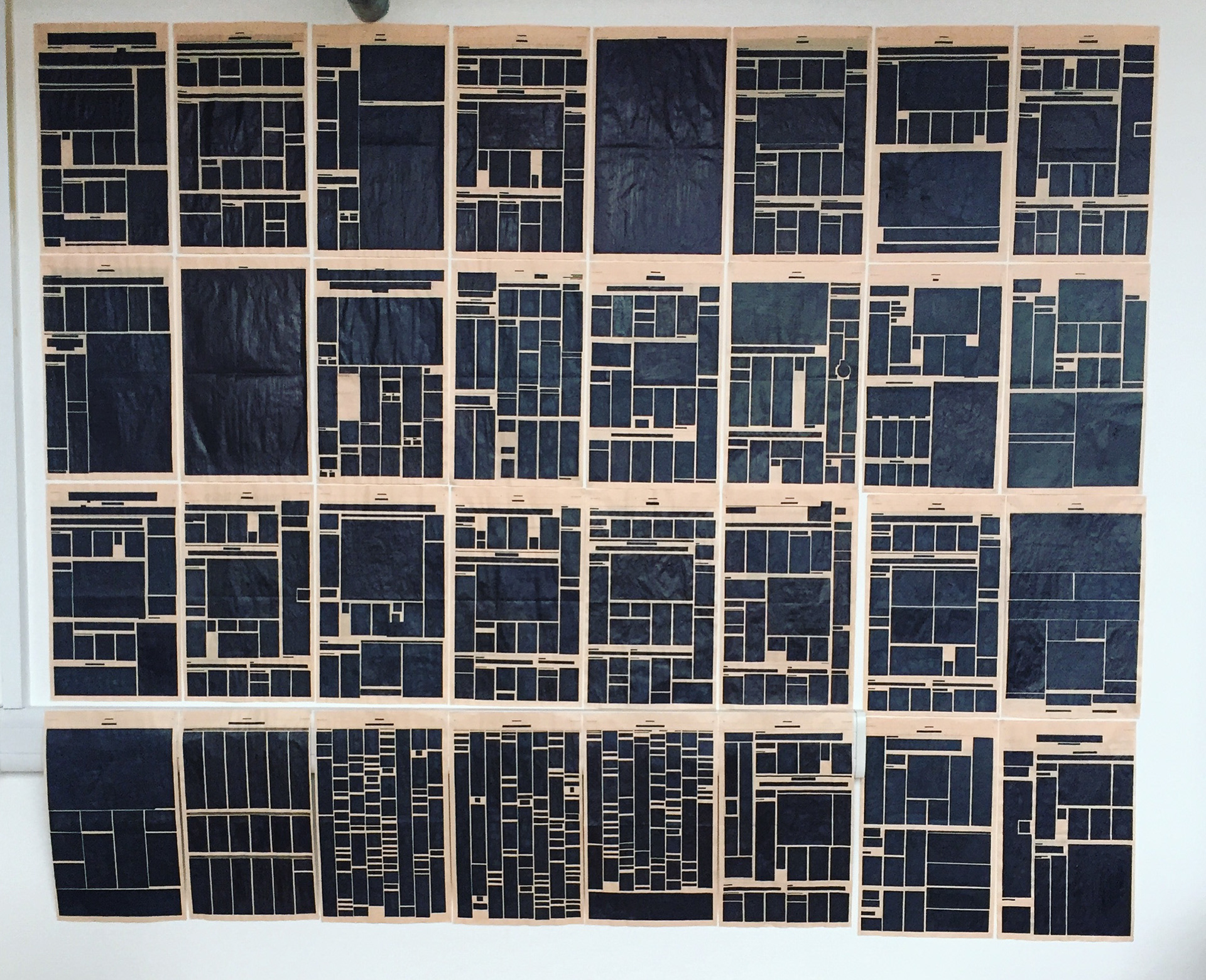
Blocking all information of each page of the Financial Times shows the use of layout, grids and hierarchy.
My inspiration was from the artist Verlag Hans Rudolf Lutz; one of his books – “Ausbildung in typogra scher Gestaltung introduces captivating and trailblazing typographical solutions.” The aim was to create a piece of design that although the information and images are blocked with a solid colour, the overall appearance still introduces the fact that you are still able to comprehend the information but through a visual process. The reason I picked the Financial Times, it’s a larger newspaper 560x345mm and has fewer pages then the Metro. The FT is split into two sections covering domestic and international news on politics and economics. Aimed for the growing audience of internationally minded business individuals. The FT has a distinctive shade of salmon pink paper colour, making it immediately distinguishable from its main competitor.