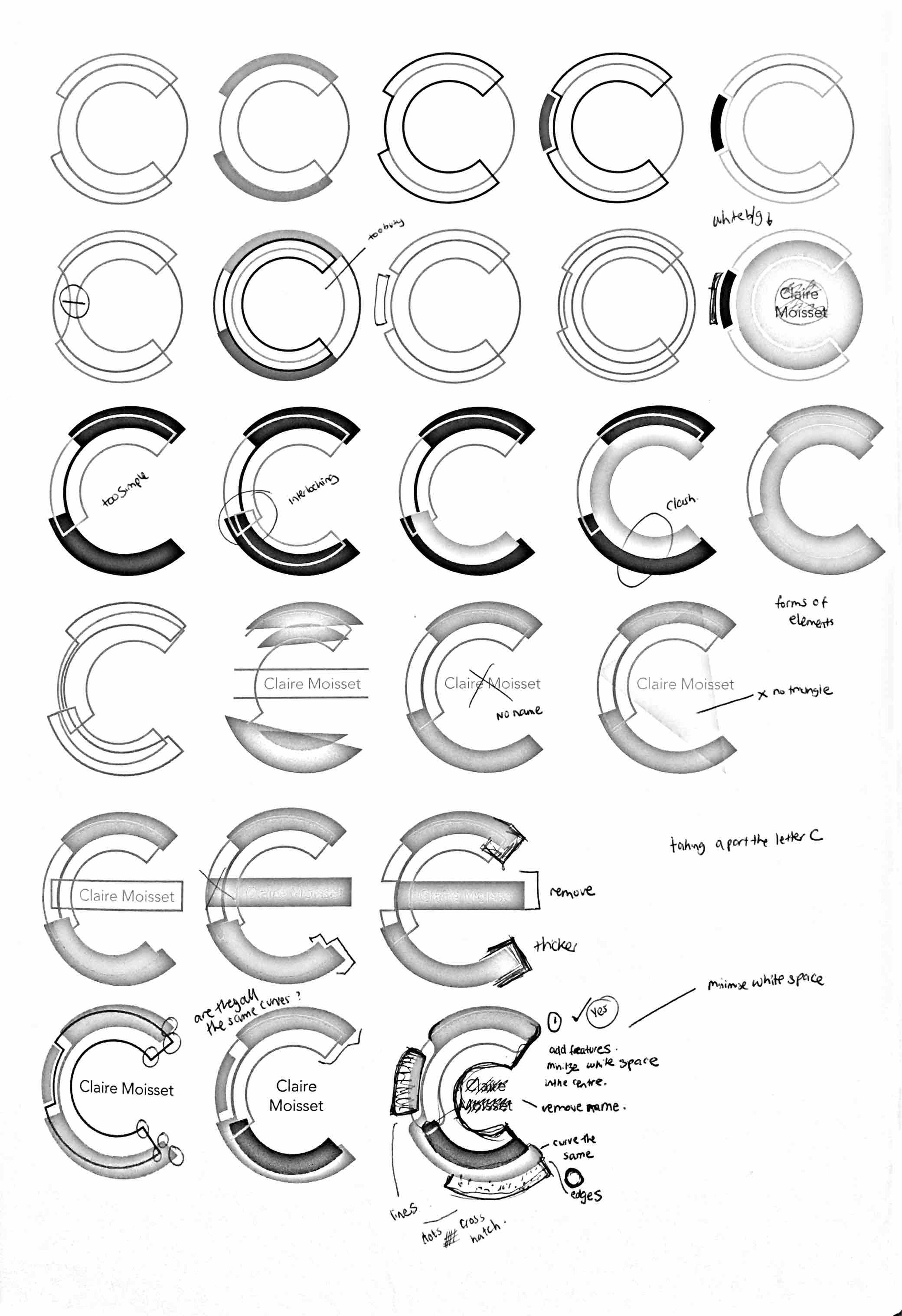
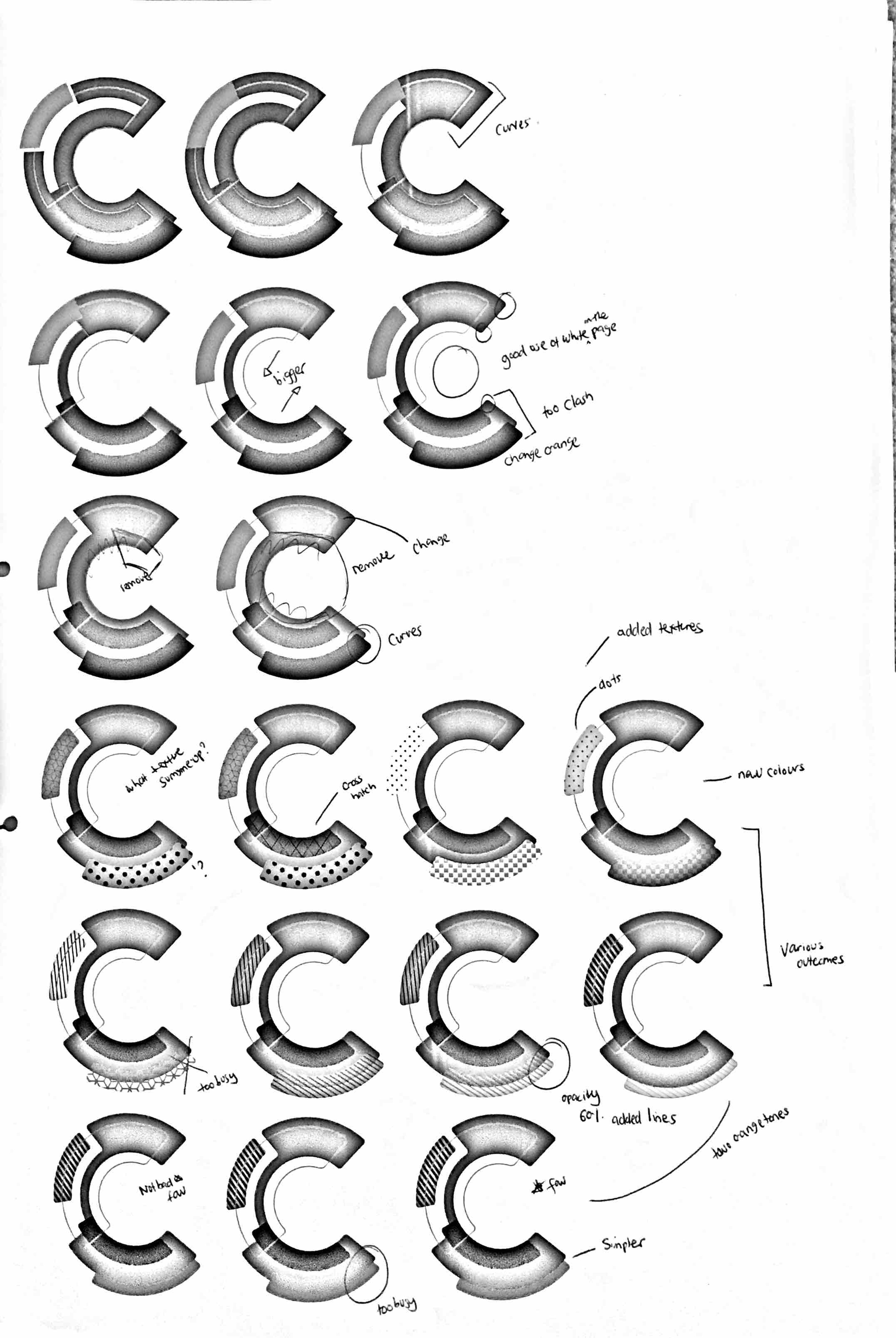
Logo.
Sketches and notes of how I created my logo brand as well as a short animation. Focusing on the C I started to de-construct the letter into layers of shapes but, still maintaining the circular format. The main reason for decomposing the letter was to show a distinctive form of the letter, each added element has been considered to give a geometric impression. The colours of grey, purple and orange have been used as they are my favourite colours and visually stimulate a suitable balance of opposing colours.