Adrian Frutiger.
A publication showcasing a colourful history to all Frutiger’s typefaces he has designed during his active years as a type designer.
Creating a publication in regards to the life’s work of Adrian Frutiger. The aim was to explore the most famous typefaces Frutiger had created for various print and digital uses and how he has changed and developed as a type designer. The book by Robert Bringhurst gave me an insight to a brief introduction of the typefaces Frutiger designed throughout his years.
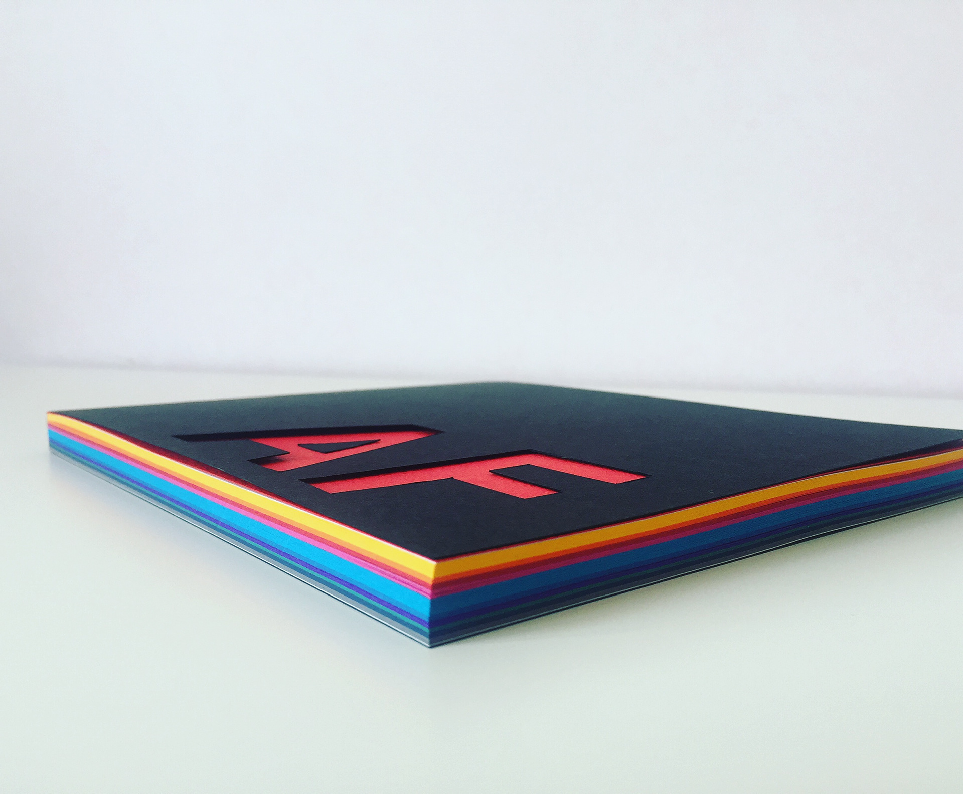
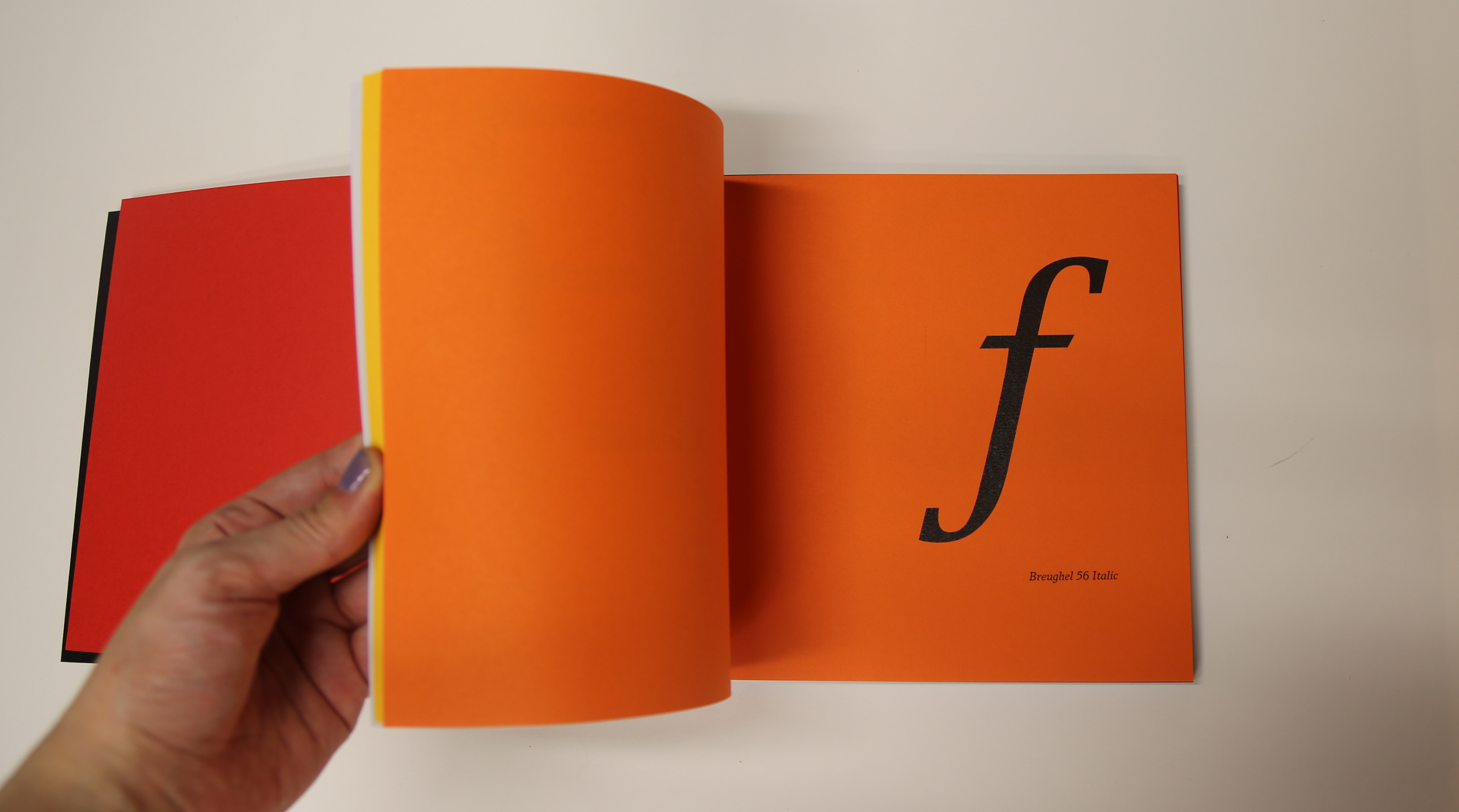
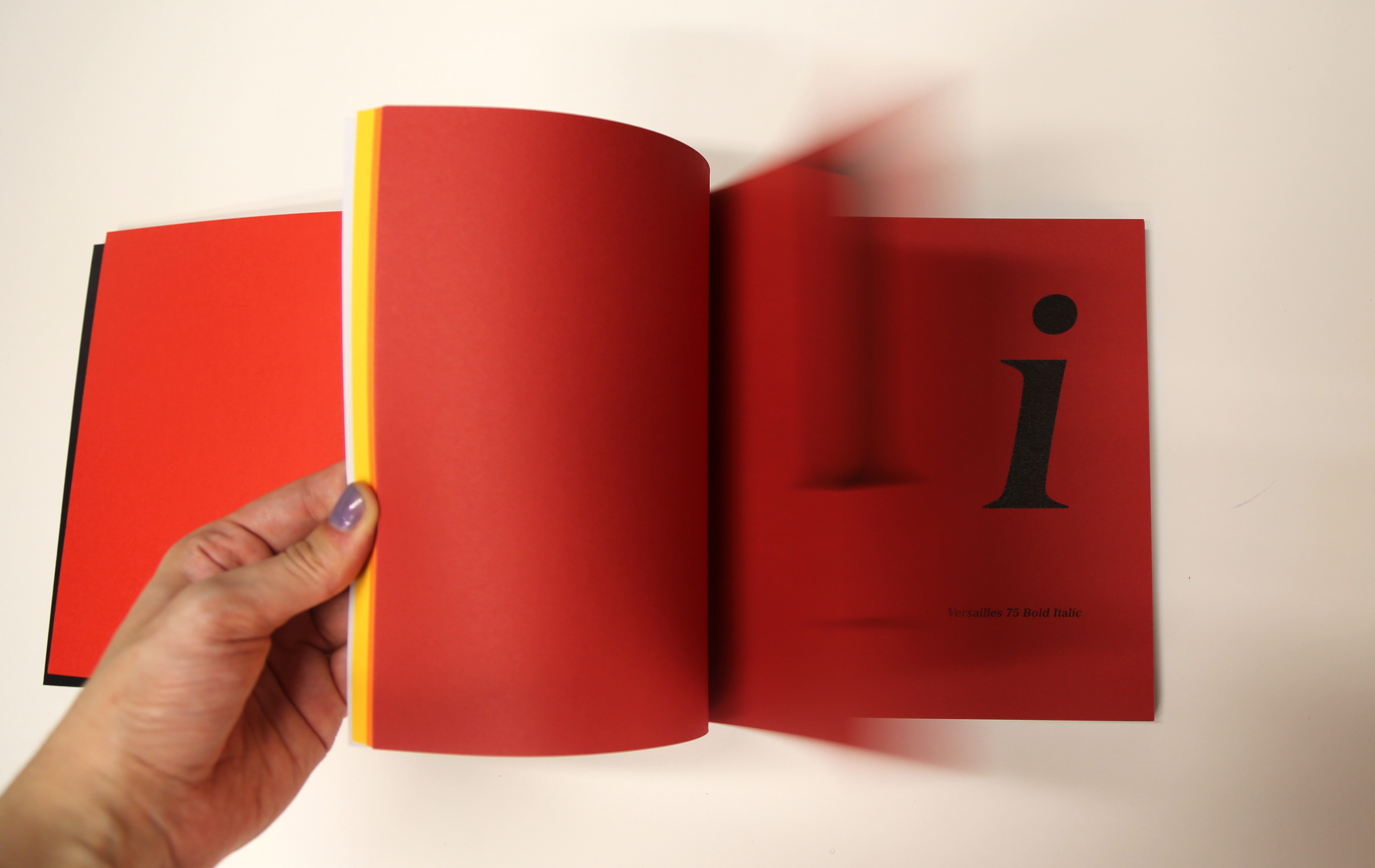
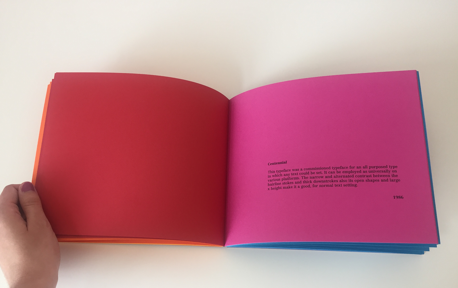
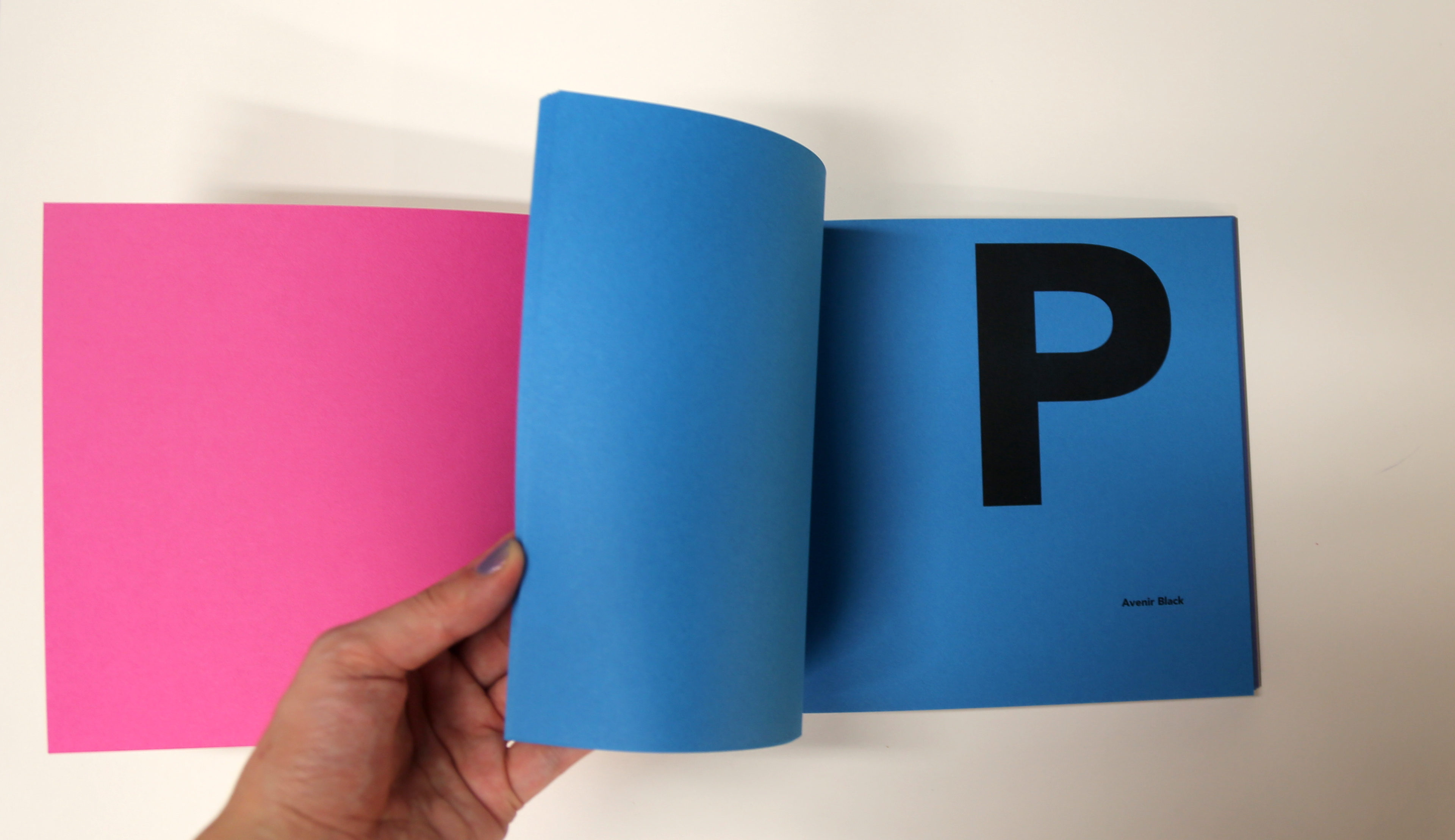
The final book displays all the letter forms in lower and upper case. Therefore I worked on various layout to fit the letters and information on the spread. Originally I added a tab system which had the year of when the typeface was produced, but this was taken away as it didn't fit with the overall look. All the letters fit on a base line and information of that specific typeface has been added underneath. The colourful paper was a replacement to the tab system, each colour section represents a typeface family/year and a brief introduction is given about the history of the typeface. The exposed spine adds a distinctive touch and gives a colourful visual impact to the overall book. The paper was supplied by G.F Smith - Colourplan 135gsm and 270gsm.